Infinibank
My Role
Creative Direction, Branding, Visual Design, UX/UI
Year
2022
-
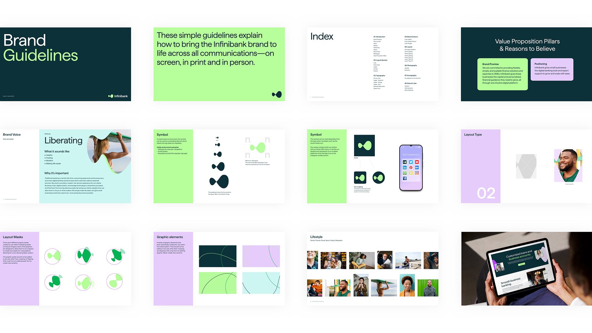
The infinity symbol is a fundamental building block of this direction. It visually presents the idea that growth can be smooth and simple.
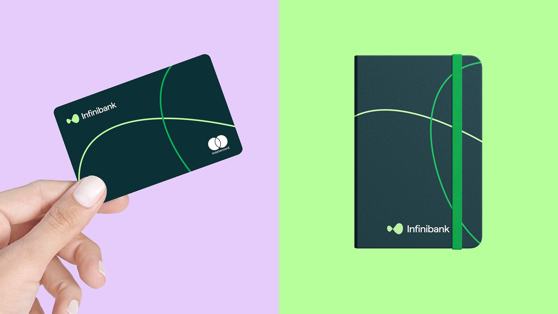
At the same time sharp elements make it possible to establish links between small and large states within all designs - reflecting both Caregiver principles as well as Outlaw traits. The juxtaposition between roundness on one side with knives coating them up makes for an interesting balance between these two primary archetypes - a perfect blend which can be seen throughout the entire identity system.
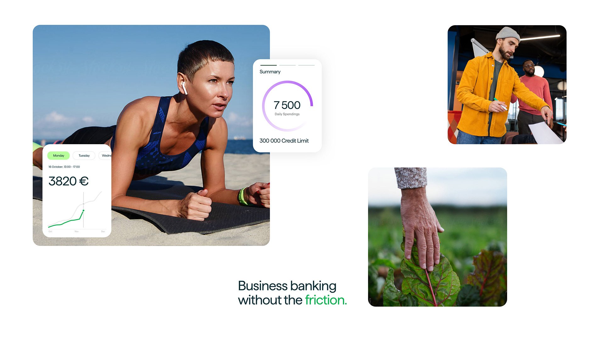
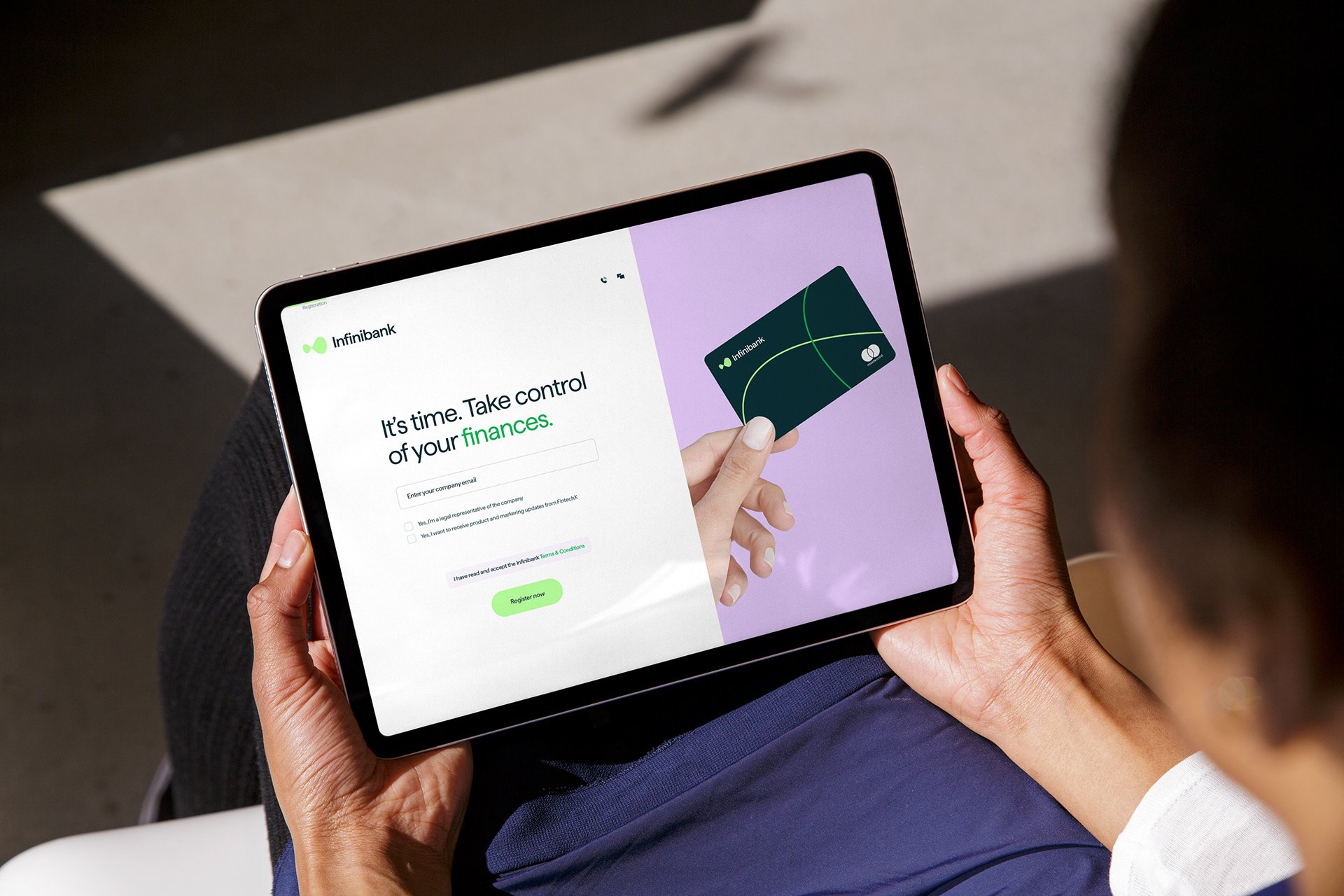
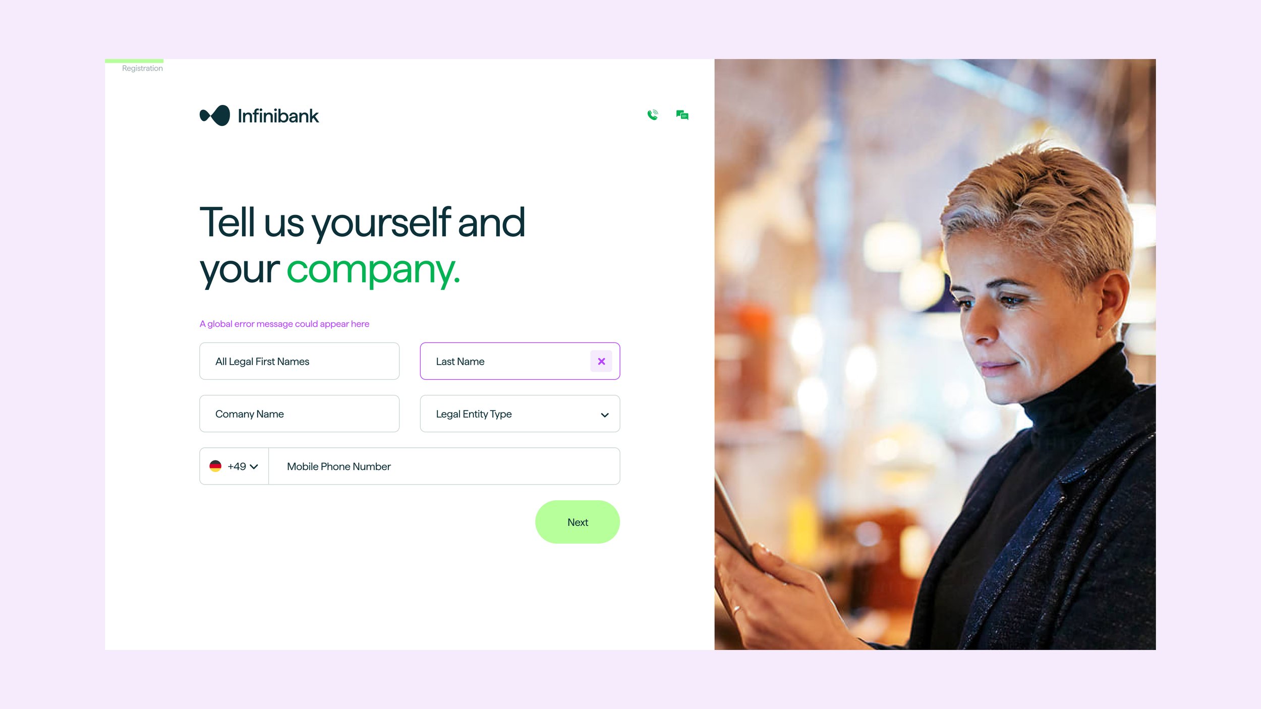
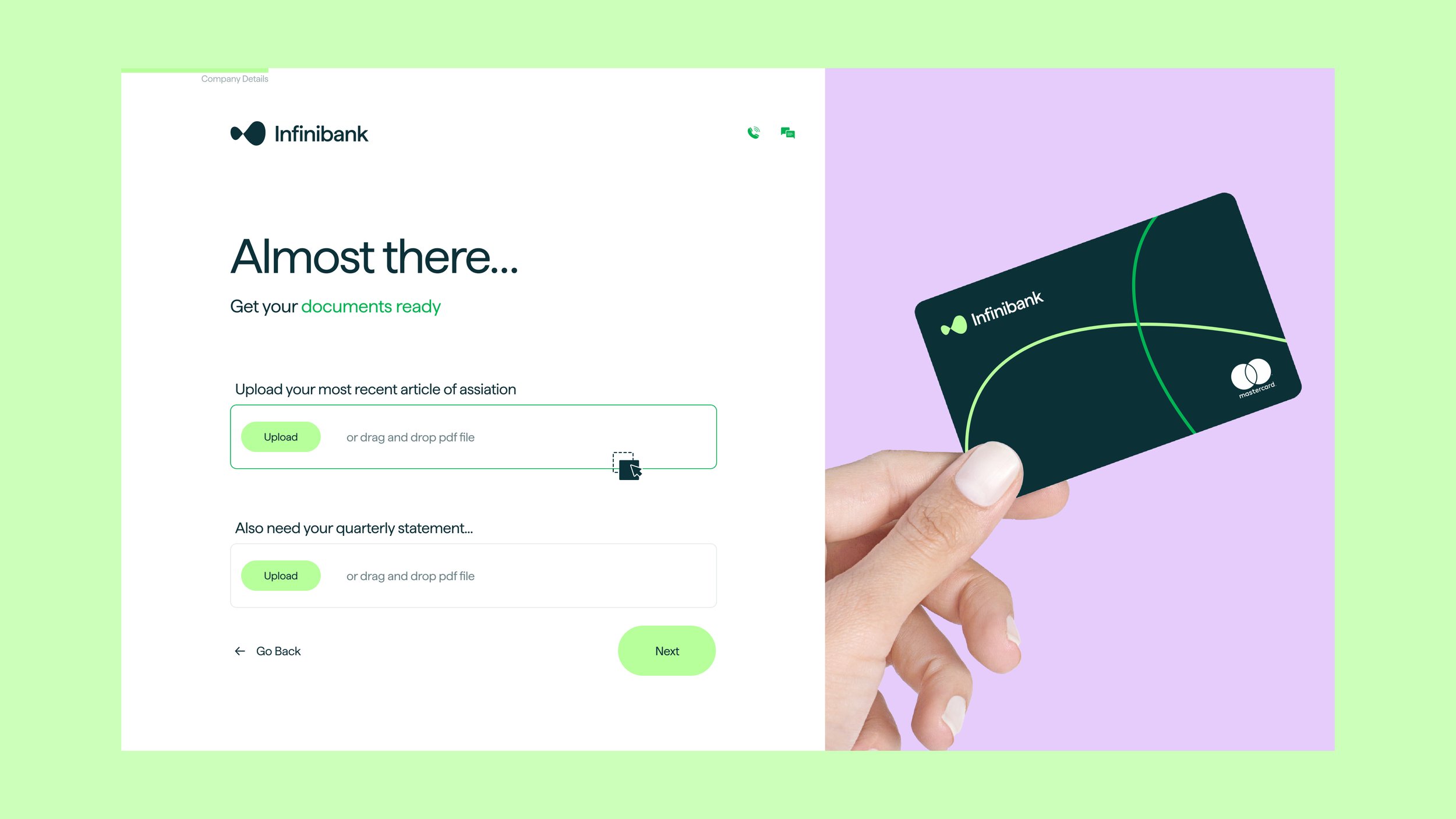
The color palette is composed of calm, cool shades that contrast with vivid and exciting hues. This would allow for establishing a strong visual hierarchy across the digital product ecosystem, while also making it easy to incorporate primary or secondary call-to-actions wherever needed.
